It’s easy to get caught up in current design trends when creating any kind of print material for your client. However, putting your audience first is the best way to begin any project.
What are the main issues that come up when designing for a senior audience?
As a print designer, your main challenges involve making sure your message is getting across while also creating engaging designs. Accessibility and legibility should also be at the forefront of everything you do when addressing an older demographic.
What are the best ways to increase legibility in a print design layout?
In general, your design should be easy to read with minimal distractions. Sticking to two or three fonts and colors is best. Starting with a grid is an effective way to keep your design from getting too crowded.
“The use of grids, whitespace, and images can all have an impact on readability. Images can help create a flow through your text and give readers a place to rest. A lack of space around text blocks and in your design, in general, can make elements blend into each other. Grids help align your type across the page.” – vanseodesign.com
There are a few ways to break up your message to get the most engagement while also presenting a user-friendly design. Headlines should be larger at the top and have a bolder font. If there is any callout text such as event information or special offers, try adding dividing lines or put this information in a box to break up the copy. Adding images is also a great way to break up the page. A CTA (call to action) should be bold or in a different color, as it needs to be easy to find on the page. This color should match the overall design and not be too much of a departure from your art.

What programs should be used when designing printed materials?
The industry standard has been Adobe Creative Cloud for a while. In particular, Adobe InDesign is the most practical program to use for layout and type. Files can be set up with margins, bleed, and slug areas which provide print-ready files for a smooth transition to the printer.
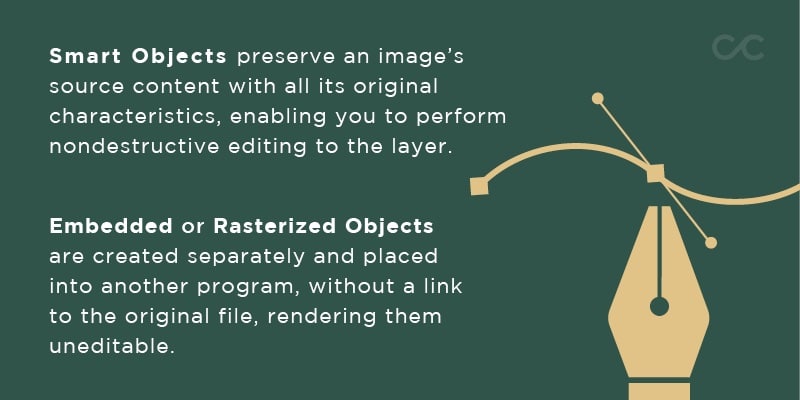
Adobe Creative Cloud programs work together to create a seamless transition between programs. Placing Smart Objects or Linked Graphics in your work allows you to continue editing your art in Photoshop or Illustrator while it automatically updates in InDesign. This works in a variety of ways in each program, with Photoshop giving you the option to place a Linked file versus an embedded file. When you’re ready to send your file to print, remember to embed your artwork if it is linked locally to your computer. This way, the printer will have everything they need to print a high-quality design.
Another advantage of using Adobe programs is the integration of Adobe Fonts. These commercial-free fonts can be downloaded from fonts.adobe.com and will automatically install into your Adobe programs.
Which types of colors can be used for print design?
It can be easy to mix up the types of colors that can be used for print or web design projects. CMYK (cyan, magenta, yellow, and black) and PMS (Pantone Matching System) colors are specific to print design, whereas RGB (red, green, and blue) or hexadecimal (HEX) colors are specific to web or digital projects. Here is a breakdown of each color system for print and when to use them.
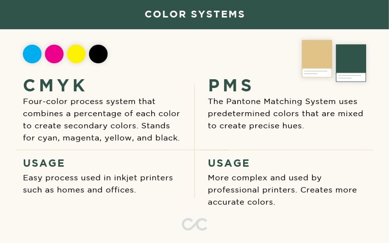
It is best to use Pantone colors for branding purposes, such as logo design and corporate stationery. CMYK is more likely to be used in smaller print jobs such as flyers and postcards.
What are some best practices when choosing images or textures for a senior audience?
As designers, it’s important to remind ourselves of the great words of the architect, Louis Sullivan. “Form follows function.” Print design should be functional first, meaning, your message should be clear and easily readable. Once you’ve concurred that, then you are able to add supplementary imagery and textures. With each addition, repeat those same words: Is this functional? Is my message getting lost?
With senior living in mind, your image choices should check all of these boxes:
- Group of three or more people
- Happy and engaging in an activity
- Diversity present
- Consistent with content

For more examples of acceptable stock images to use, refer to our UX & Print Combo Blog. Background textures should be opaque and not too busy. Again, does this add or detract from the message?
How will I know if my designs are of a high enough resolution to be printed?
There are several aspects to making sure your printed material will look clear and crisp.
- Ensure your document and all images are set at 300 dpi (dots per inch)
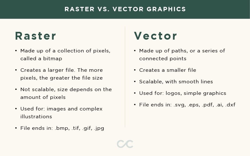
- Using scalable vector graphics in EPS (Encapsulated PostScript) format for simple graphics
- Using high-resolution rasterized images for detailed graphics
- Exporting PDFs in a high-quality format
It is important to aim for a high resolution when using rasterized graphics. Rasterized graphics are more likely to lose quality because they are pixel-based images, creating a limit to how large the image can get. However, scalable vector graphics have no limit to how large they can get, giving you more freedom to use them on projects with a variety of sizes.
How do I set up my file for the printer?
To make sure your piece is ready to print, you must always consult with your printer to ensure your document is set up correctly. Most printers will ask for the following criteria:
- Ensure that all fonts are outlined
- Embed all external links and images
- Export your file with bleed and crop marks
Outlining fonts is beneficial to the printing process. This ensures that your fonts will be displayed in the final artwork if your printer does not have the correct font file that is being used. Outlining text simply turns native text layers into graphics. When this is done in Adobe Illustrator or InDesign, these files can now be used as scalable artwork. To outline text, simply select the type you would like to outline, and go to the Type menu and select Create Outlines.
If you cannot outline the fonts that were used, be sure to provide your printer with font files. This also applies to all linked images and graphics. The best solution for this is to package your file in Adobe InDesign, which will include all of those items by going to the File menu and selecting Package. From there, you will have more options to add folders of all your font files and images for the printer to reference.
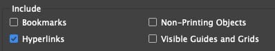
Hyperlinks can be added in Adobe InDesign for digital PDFs that are used online. This way, the senior is able to click on these links that will take them to an external source mentioned in the design. These links will not work for printed artwork. To add these hyperlinks, you must select the words that you want to turn into a link and go under the Type menu. There you will find the option to add a hyperlink. When exporting this type of work, select PDF and make sure Hyperlinks are checked in the PDF dialog box before saving.
If you are using any of these methods in your work, you are bound to increase your accessibility for a senior audience. The printing process is just as important as the design process, so making sure you are taking the proper steps along the way is key. For more examples of successful layout design, refer to Craft & Communicate’s print portfolio.
Do you need help with your next print project?
Continually utilizing all these methods will help guide you to create successful print designs for your client. If you need additional help, please reach out to us for your next print project.
