A picture is worth a thousand words. Wait, let’s revise that a bit… An awe-inspiring photograph is worth a thousand words, clicks, emails, and phone calls.
As an assisted living professional, you know a good photo can showcase your community’s true spirit. But we’re not here to talk about senior living stock photos. These tips can help your team members take pictures of your residents sitting in the sunshine to new heights.
Photos are an excellent resource to share online, in your print collateral, and in advertisements. Leveraging these senior living industry photography tips will go a long way in helping your community stand out!
Senior Living Visuals Inspire Potential Residents and Their Family Members
Senior living visuals can evoke a sense of warmth, family, and camaraderie. You’ll want to inspire these emotions in someone who is not a part of your community yet.
The laughter, smiles, and conversation among your residents and associates show the active, invigorating lifestyle in your community. Think about the visitors to your community, too, whether by themselves, as a couple, or with their families.
Your community wows in person, and so should your online presence and marketing materials.
Senior living stock photos have their place, but most of us can tell they are staged and taken by professionals. When done right, senior care pictures will tell your community’s story honestly in the best possible light, grabbing your audience’s attention.
You’ll be surprised to find out just how easy it is to snap a good photo with these ten simple but effective tips!
1. Designate a Photo Ambassador
Choosing a photo ambassador for your community can simplify the photo-taking experience because it provides a more streamlined process.
Think about someone in the community who enjoys taking photos – maybe it’s yourself or another associate. What about the Lifestyle Director who sees the smiles on residents’ faces who are playing games or enjoying a community party? Maybe it’s the Concierge who assists your residents every day or a Culinary team member. Any associate with prior experience or a passion for senior living photography can be a potential photo ambassador.
Next, think about the setting of a great photo. The photo ambassador should be a frequent presence, out and about often with the residents. They should attend special events, exercise programs, holiday meals, and other activities that present the best photo ops.
2. The Golden Ratio Explained
Did you know devices like smartphones and tablets have grid line settings when they’re in camera mode? Grid lines help frame your subject appropriately with the golden ratio technique.
So, what exactly is the golden ratio? It’s about making a photo aesthetically and naturally pleasing to look at.
Your phone or tablet likely has a 4:3 standard aspect ratio. This is a typical setting in senior citizen stock photos and videography. The ratio establishes the proportional relationship between the width and height of your camera frame.
When you have your gridlines in view, they are proportionate to the golden ratio, which breaks up into a Fibonacci sequence. Hang on, I know we’re getting technical, but stay with us!
The Fibonacci sequence breaks down each square into smaller squares on your screen to capture a great photo.
When you see the gridlines in camera mode, two horizontal lines intersect with two vertical ones, creating nine rectangles. You’ll want to line the subject or objects near or on the intersections of these lines.
Seeing a photo matched up to the golden ratio is naturally pleasing to the human eye. By lining up your subject with the grid lines on your device’s screen, you can get your shot to look fantastic.
The grid option can be turned on under your camera’s settings.


Meet Sue, our lovely volunteer! The first photo has the subject lined up with a smartphone’s grid lines. Although both photos look great, there is something more naturally pleasing to the eye when viewing the first photo.
3. The Perfect Candid Photo
Candid photos are invaluable for showing the positive atmosphere of your community. It may go without saying, but people naturally gravitate toward a resident smiling or laughing versus someone who doesn’t look like they’re having a great time.
But even if you do catch a subject smiling, it may be ill-timed with an eye squint or blurry movement. A good candid photo is also about timing.
Watch how your residents interact in different settings. You’ll notice how they communicate with each other and see who is smiling or laughing more. Who is everyone listening to and who has the most energy?
As you figure out these patterns, you’ll know who and what to capture at the right moment. And if you think you’ve taken enough photos, take even more so you’ll have plenty to choose from.
Consider how you can help the photo become truly special, too.
Think about someone trying to take your picture. If they keep asking you to smile, it can feel annoying and the photo can end up looking forced.
But what about asking them questions that make their faces light up? People love talking about themselves and it can make their cheeks glow and eyes shine. For some, maybe it’s just talking about George Clooney (especially among the female residents!) Maybe it’s asking them about their families, their greatest achievements, or their favorite hobbies.
Take a look at our examples below with Sue and John.


Which photo would you rather be a part of? In the second photo, it looks like John is telling a great story and Sue is quite interested! This photo was captured at the right moment with no displeased or awkward-looking expressions.
4. Sending Photos
Sending photos the appropriate way, whether it’s to your marketing agency or social media manager for online use, is crucial. There are several ways to send photos, including:
Let’s say one associate takes a photo that has great quality and resolution.
When the associate embeds the photo into the email, the resolution becomes distorted as it is sent to the next person. Then, that person forwards the email chain with the embedded photo. Next thing you know, you can’t even tell what’s in the photo anymore!
Here’s how to send a photo without compromising its resolution.


Examples: In the second image, the photo is being sent as an attachment rather than being embedded into the email message.
When you take the photo on your device, tablet, etc., be sure it is sent as an attachment in your email. Sending the file as an attachment maintains its high resolution.
Online Photo Submission Forms
It can be a pain for senior living community associates to send photos. File-sharing services can involve long processes, or your email server might not allow you to send high-res photos. Your marketing agency should rise to the challenge by presenting a clear, easy way for you to send photos with no hassles.
At Craft & Communicate, we provide our clients with unique, online photo submission forms through customized links. It’s easy, it doesn’t compromise quality, and it provides adequate space to easily upload high-res photos.
Learn more about how we make our clients’ lives easier. Feel free to reach out!
5. Look at the Whole Picture
A great photo of a person can come out wrong when photographers forget to consider the background and nearby objects. Simplicity and consistency are key factors to think about here.
Taking a picture of someone against a solid color is better than a wall that’s heavily patterned and complex. These types of backgrounds can be distracting for the viewer and potentially take away focus from your subject.
It’s also a good idea to look around for displeasing objects before taking your photo. If there is a trashcan or half-eaten plate of food in your shot, moving them away before snapping the photo can make all the difference.


Examples: Our attractive subjects and a clear sky make for a wonderful photo … until you see the dumpster in the background. Moving objects out of the frame can do wonders for your photo. In the next photo, the background is simple and easy on the eyes.
6. Angle Appropriately
Angling your shot is crucial, but how you do it depends on the kind of photo you want to capture.
Keep these orientation tips in mind when you’re angling your shots:
- Horizontal angles are usually the best option, especially when you want to capture the subject and the surroundings. A resident who is gardening outside or eating in the full-service dining room is best photographed at a horizontal angle to capture the appealing atmosphere, too.
- Vertical angles work best when you are taking pictures of a person who is the sole focus.
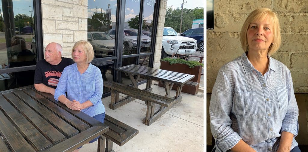
Examples: In the first photo, the horizontal angle captures our subjects and the background. The second one has a vertical angle that focuses on one subject.
7. Optimal Lighting
It’s best to have your subjects well-lit, so think of areas in your community that offer the best lighting. Windows are natural diffusers of light and automatically make the photo ten times better.
Photographers should be positioned between the window and the subject whenever possible. It’s best to have the window behind you instead of behind the subject.

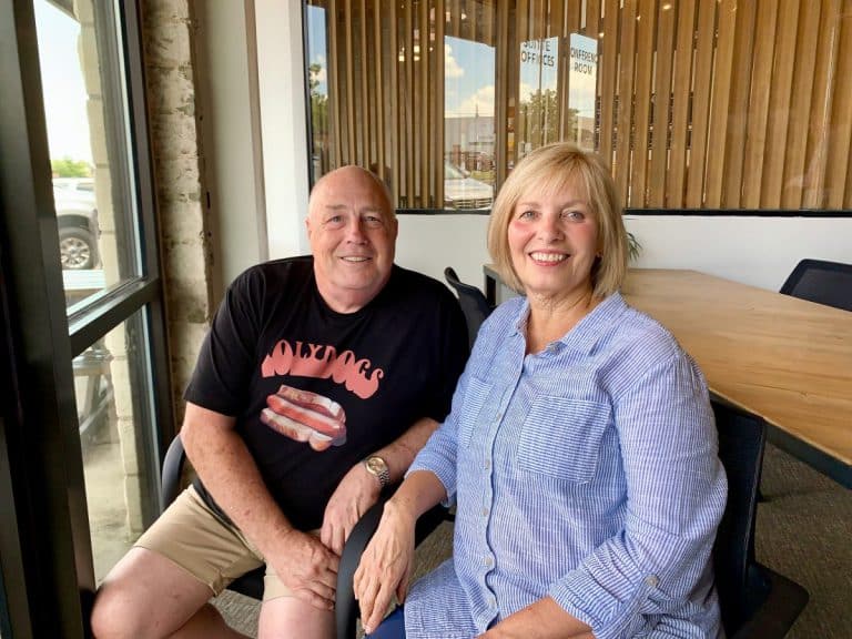
Examples: Our subjects in the second photo pose with beautiful natural light. In the first, the light behind our subjects creates a silhouette effect, hiding them from view.
8. The Eye Line
Which photo below makes you feel like you’re sitting with the subjects?
Be sure you’re at eye level with your subject, whether they are sitting or standing. When a photo is aligned this way, you feel like you’re in the shot versus feeling like an outsider looking in.
Think about the happy hours or get-togethers in your community. Would your visitors feel more included seeing photos at eye level with your residents gathered around the table, or from way above their heads? Snapping a shot that isn’t at eye level with your subject(s) takes away from the genuine emotion of your photo.
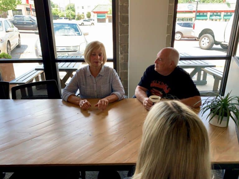
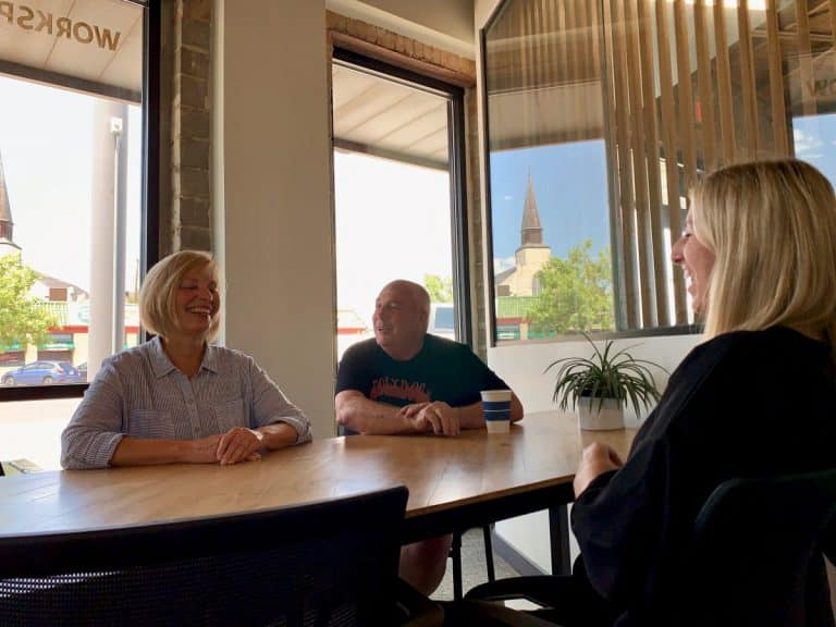
Examples: The couple in the second photo is at eye level but in the first one, the viewer needs to look down to see them.
9. Don’t Use Pinch-Zooming
Pinch-zooming on the screen may seem tempting on your smartphone or tablet. However, because your phone is using its zooming lens, it distorts the quality of your photo.
Instead of using the pinch zoom feature, try to take a few steps closer to your subject.


Examples: Let’s bring back our lovely subjects standing against the white wall. Notice the automatic blurriness of the first photo, an example of pinch-zooming from a phone or tablet.
10. Emotion is Key
Here’s the biggest tip to keep in mind: Think about the story you want to tell.
By using these key tips, you will be serving up clear and emotional shots that truly show the identity of your senior living community in no time.
Your community is a phenomenal place for seniors to live and they love being there. They know it, your fellow associates know it and so do you. Share the story with your leads, guests, and audience through fantastic photos.
How Can We Help?
Craft & Communicate is a marketing agency dedicated to senior living. We work to elevate your brand through real stories, real people, and heartfelt emotions. Contact us and you’ll see the difference.

