Learn About Our Changing Visual Perceptions
Can you see the difference between good and great use of color?
What are your strongest methods of persuasion? At Craft & Communicate, the senior living operators we serve benefit from sales copy that speaks directly to seniors by describing the luxurious and sociable lifestyles they can attain at senior living communities. Our colorful designs further captivate them.
Strategic use of color can encourage customers to pay more attention to your words due to their ability to communicate through emotion alone. Read on to discover how you can use color more effectively to intrigue your audience and grow your business.
How can we better understand color?
From the time I began to speak, I learned to name the most essential colors of a rainbow, the earth tones brown and beige, and the range of values from black to white. Throughout time, I continually added new words to my vocabulary: mixtures of those colors such as red-orange and yellow-green, light tints including pink and pastel violet, and dark shades spanning from forest green to midnight blue.
As we continue to gain new experiences full of interesting colors, our vocabularies will naturally expand to describe these hues.

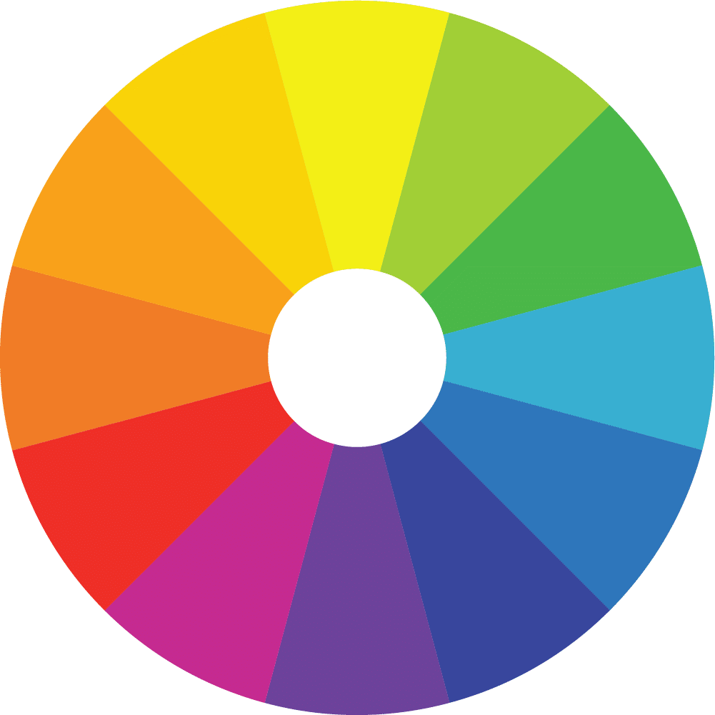
We may also adopt some terms that explain their classifications and connections between each other as they would exist on an artist’s color wheel.
The color wheel is a great way to simply visualize a triad of the primary colors red, blue, and yellow, which can be mixed to create the secondary violet, green, and orange. Each tertiary color, such as yellow-orange, is a combination of one primary and one secondary hue. Complementary colors are directly across from each other while analogous ones are side-by-side.
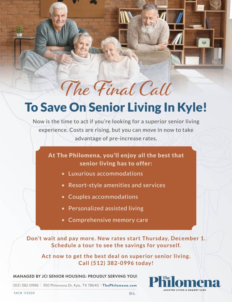
In terms of color temperature, the entire wheel is split into two sides. Colors to the left consisting of red, orange, and yellow are called warm colors; they evoke feelings of warmth because we commonly associate them with sun and fire—but also with happiness and friendliness. The green, blue, and violet on the color wheel’s right side are referred to as cool colors since they remind viewers of cold environments, as well as stillness and isolation. These associations may vary from person to person and change with different versions, combinations, or contexts of each color. Below are several examples of traditional and unexpected uses of warm and cool colors within Craft & Communicate’s original flyers.


Value scales—either in color or in black-and-white—show steady progression from dark to light; the tint (lightness) or shade (darkness) of a color is referred to as its tone.


The words we use, however, will always be limited in comparison to the millions of colors from which designers can choose. In addition, most of these colors seem subjective to us; their appearance can change depending on the context in which they are shown.
What is simultaneous contrast?
If two different colors are physically near each other, they will both look more similar to their nearby color’s complement due to simultaneous contrast. Dark values and tones tend to help lighter ones appear closer to white. Increasing the size of an element may also strengthen its seemingly color-changing effects.


How can these concepts influence the design of your marketing materials?
Although using a variety of colors and values can help your designs get noticed, thoughtfully applying them will delight your potential customers and encourage them to take action. While there is no single best color scheme for all businesses, you can still consider a few guidelines when creating and applying yours.
Complimentary colors often create pleasing combinations; analogous colors provide a sense of unity. Warm, light colors tend to stand out the most and are best for encouraging customers to contact you—particularly when placed against dark, cool backgrounds, which seem to recede away from their viewers.
If two of your design elements of the same color appear very different because of their surroundings, you may emphasize or de-emphasize either element by keeping their colors the same. Another option is to change one color so that it only appears to match the other.

Once you are aware of the profound effects colors can have both alone and in relation to one another, you can leave a lasting impression on your audience. We at Craft & Communicate have observed the power of color firsthand through our own marketing materials that have achieved excellent results due to their memorable designs.

- Lauren, C&C Digital & Print Designer

