
What are some rules to follow when it comes to typography for a senior audience?
For headlines, fonts can be a little more whimsical but still need to have clarity. Serif and some script fonts can be used for headlines, while a bolder sans-serif font is best for sub-headlines. As for body copy, a legible serif font can be used, but a clean sans-serif font with a book or medium weight is your best option. Below you will find examples of some font choices to use.
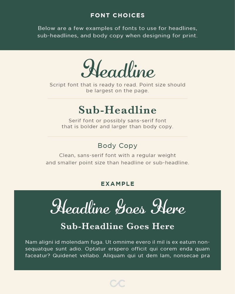
Point size is another major factor when laying out typography for a senior eye. As a general rule, try to stay between 12- and 18-point sizes for best visibility. If possible, aim for the 14- to 16-point range, as anything smaller can be challenging to read. Increasing leading and kerning are also great ways to improve readability. Leading is the space between lines of text, while kerning is the space between letters.
What are the best colors to use for an older demographic?
There are many factors that contribute to color pairings and their effects on seniors. Before designing for this audience, ask yourself a few questions: Do you want to evoke a certain emotion? Is there something that needs to grab the attention of the audience?
Complementary color schemes such as blue and orange are common choices for websites because they contain plenty of variation between “cool” and “warm” colors. Cool hues are often used for backgrounds, while warm ones are best for links and transactional calls to action.
Contrast between light and dark values will also help to make your site more engaging and readable. Find out which colors will be most accessible across the board.
Sets of contrasting colors tend to be most distinguishable for color blind seniors as well; consider how multiple types of color blindness may affect vision. You can enter your ideal color palette into this simulation to see from the perspectives of those who view color differently.
”The older eye is less able to make out low contrast patterns. According to the National Eye Institute, in the US, from the age of 40, contrast sensitivity starts to decline until the age of 80. It may be reduced by up to 83%. This has profound implications when designing technology for seniors.” – eldertech.org
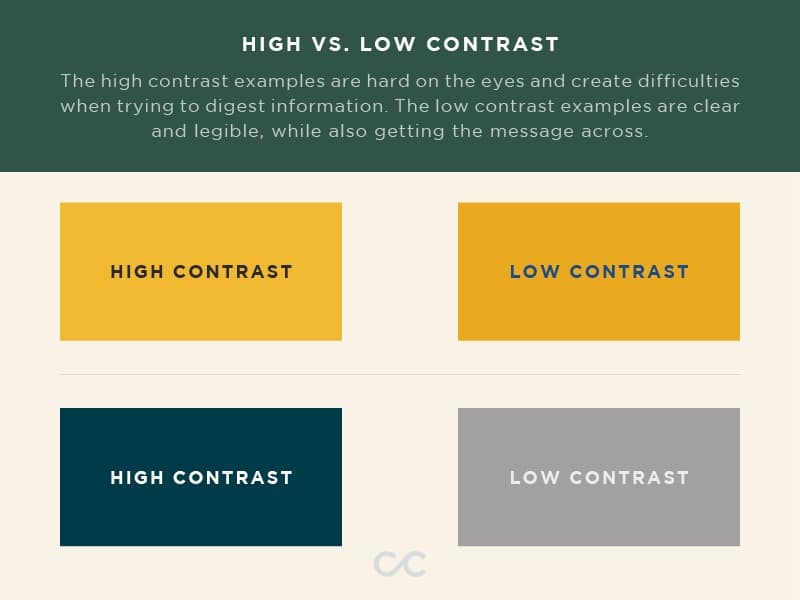
Color-based accessibility should be taken into consideration at the beginning of every project. Without it, you run the risk of your audience not receiving the important information, or any at all, which is the main purpose of what designers and marketers do. Staying away from neons and highly-pigmented colors is a safe way to approach all print and web-based projects.
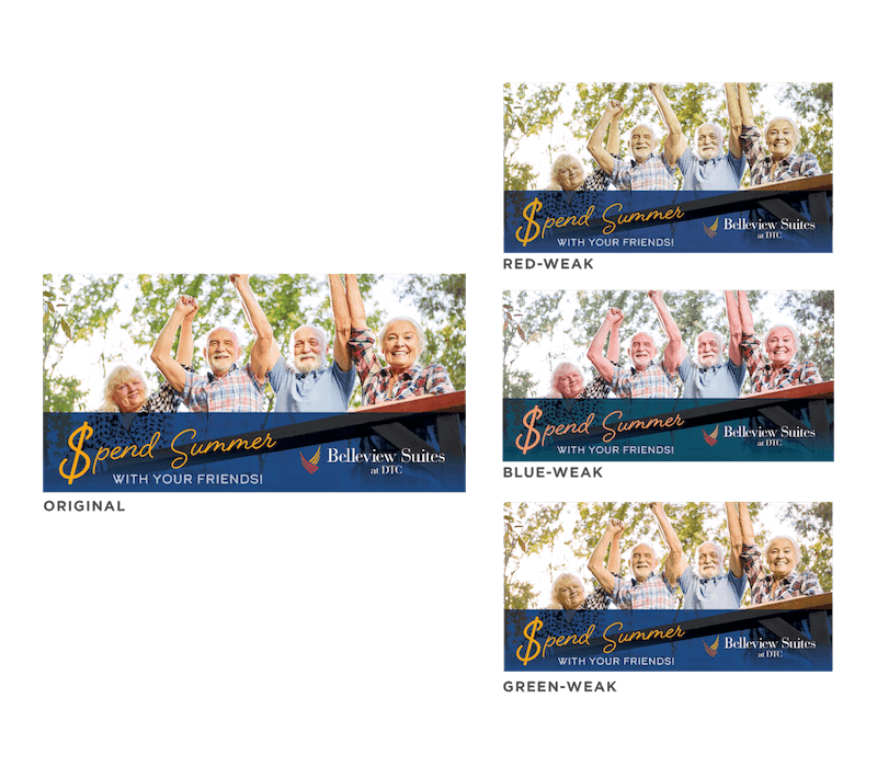
Color blindness is another important factor when considering your color palette. Remember to incorporate other elements such as icons, patterns, and textures to guide the audience, instead of limiting your message to just color. This is something that might not always work in every design, but it’s best to use these elements on larger scale projects such as brand colors or websites. Below is an example of different types of color blindness. This test can be done by uploading your work to this website and clicking through the options to make sure your message is still legible.
Which imagery is best?
Most types of image files are in one of two categories: raster or vector.
- Raster images consist of small dots of various colors and values. The more pixels per inch a raster photo has, the higher its resolution (clarity) and file size. If you try to expand the size of any raster photo—especially one that is small in dimensions and file size—you will notice that its resolution decreases.
- JPG and JPEG file types are often raster photographs and never contain transparency.
- PNGs may be partially-transparent and tend to be more versatile, since they are often used for logos and other digitally-drawn graphics whose non-rectangular edges should be preserved, especially when placed against backgrounds with patterns or gradients.
- Vector graphics are generated using mathematical formulas. They are typically smaller files and are scalable, which means they do not lose quality if their size increases.
- SVG and EPS file types are ideal for print media due to their scalability. However, they should not be uploaded to the web due to potential security risks.
- Most files intended for print are exported as PDFs. These files are safe to upload to the web.
High-resolution raster images are generally recommended for print materials; websites should display images resized to smaller dimensions and compressed to smaller file sizes.
Where should I find images to use?
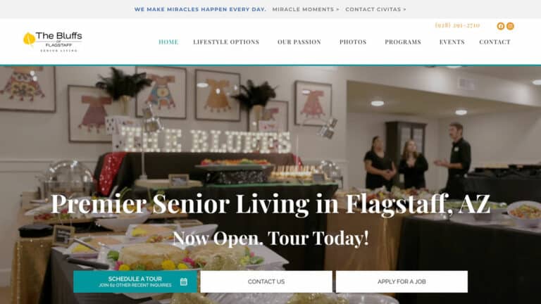
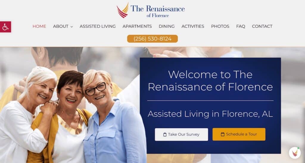
It’s always best to have a conversation with your client to see if they have any of their own images to use for your design. Having images of real people and places provides a better connection to the audience and gives a real sense of what the community looks like. Sometimes this can’t be provided, and we must then use stock imagery.
The vast world of stock photography can get overwhelming. Here are a few guidelines to help set parameters when selecting stock images:
- Look for groups of three or more people to show community
- Choose happy people who are engaging in an activity
- Diversity should always be present
- The photo should be consistent with the content. For example, a summer ad should show people out in the sunshine.
Below are some examples of stock images that meet these guidelines.


Another important factor is the location from which you can download these images. There are a number of ways to find stock photos, but Google Images is not one of them. There are copyright laws that could make things complicated, and these images usually have a lower resolution. There are also a ton of free websites that provide “commercial free” photos. While that sounds great in theory, there may be some stipulations in the fine print that could cause you problems down the road.
It’s best to use trusted websites that allow you to join and pay for a subscription. You will then be able to download high resolution images while also complying with copyright laws. Here are a few websites from which you can choose:
- Adobe Stock (syncs with Adobe Creative Cloud subscription)
- Shutterstock
- iStock
Once you have chosen an optimal layout, elegant contrasting color scheme, and personable photos, you will have much of the knowledge you need to promote your brand by designing flyers, postcards, digital advertisements, and more.
Need specific design advice?
Stay up-to-date with our blog by signing up for our newsletter below to receive even more information specific to print and web design. If you are looking for hands-on designers for your senior living company, browse C&C’s print and web design services as well as examples of our past work. We would love to hear from you!
