Web designers and developers for senior audiences and their adult children strive to balance style and usability. Continually improving your senior living website by ensuring that it is visually appealing and meets the needs of older adults is one of many excellent strategies for connecting with potential residents.
What kind of user experience should any senior living website provide?
While their content, color schemes, and order of information vary, the best websites for older adults have easy-to-understand layouts and navigational elements, load quickly, adjust to various device sizes, and are as accessible and secure as possible.
How can I design websites with seniors in mind?
Whether you are writing nothing but custom code or using a drag-and-drop builder to create your website, your arrangement of content, links, and images on a page can drastically change how seniors interpret those elements.
Organize Your Information, but Keep It Interesting
Split Up Your Sections
Content is most easily understandable when it is split into several blocks of consistent background colors, sometimes behind subtle patterns. The difference in color between these blocks may be slight—often in the case of consecutive informational content—or it can be drastic, such as the change to a darker color behind a CTA (call to action), which can draw attention to that section and further encourage visitors to reach out to your community through a form or button that links to one.
Vary Your Text
Choose Sophisticated Fonts
Below are web-safe fonts that are pre-installed on most computers’ operating systems, so their intended styles are most likely to be seen.
- Arial
- Verdana
- Helvetica
- Tahoma
- Trebuchet MS
- Times New Roman
- Georgia
- Garamond
Courier New- Brush Script MT
If you are looking for more variety, you can also use Google Fonts by either importing them into your CSS file(s) and linking to those in your HTML document(s). Alternatively, like other website builders, Elementor’s interface contains a dropdown list of Google Fonts by default. Its content management system, WordPress, contains a similar list of predetermined fonts. Both applications also allow you to upload and use more custom fonts.
Since one component of usability is speed, be aware that adding plugins, fonts, and other files to your site can slow the time it takes to load.
After you have decided which of your favorite fonts best complement each other, consistently use one for paragraph text, another for headings, and possibly one or two more for subheadings or very small text.
Create Heading Hierarchies
Place the largest heading (an H1-level heading in HTML) at the top of each page and smaller headings to signal subsections below it (H2 to H6) without skipping a heading level. This will help seniors infer which information is most important. In addition, if anyone uses screen readers to browse your site due to visual limitations, he or she will be able to both identify heading levels and skip to sections they predict will be most important based on each heading’s text. Maintaining logical heading hierarchies is only one step you can take to make your website more accessible according to the Web Content Accessibility Guidelines (WCAG) 2.1, currently the most well-known set of recommendations on this topic.
Add Photos, Videos, and Other Media
Images and videos may be placed within heroes, side-by-side with text, or as full-width sections. When choosing stock photos, try to select those containing groups of three or more happy, active, and diverse seniors. All media should reflect its nearby content.
For faster loading times, try to minimize your use of videos (typically MP4 files) and PNGs (transparent raster images). JPG and JPEG files should make up the majority of your imagery. If necessary, you can also add links to PDFs such as activity calendars and newsletters. Avoid vector files other than PDFs—such as those in SVG and EPS format—because they may compromise your website’s security.
Consider the following file types as well as their maximum sizes and dimensions. Adobe programs such as Photoshop and Acrobat DC offer some of the best techniques for resizing and compressing files.
Note that kilobytes is abbreviated as KB, the acronym MB represents megabytes, and px is short for pixels; in, of course, stands for inches.
| File Type | Maximum File Size | Maximum Dimensions |
| JPG/JPEG | 200 KB | 1500 px |
| PNG | 400 KB | 1200 px |
| Video/MP4 | 5 MB | 1200 px |
| 2 MB | 8.5 x 11 in (letter size) |
When saving each file, include the name of your website, company, and/or community along with a description of the file, with each word in lowercase and separated by dashes.
If they are non-decorative, these files will need HTML’s alternative (“alt”) and title tags, which help screen readers communicate their descriptions. According to common website accessibility standards, alt and title tags should be exactly the same. Similarly, seniors who view your videos can benefit from accessing captions and/or transcripts. They may also appreciate videos that do not autoplay and are automatically muted.
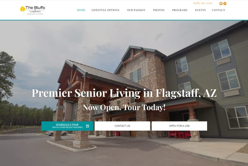
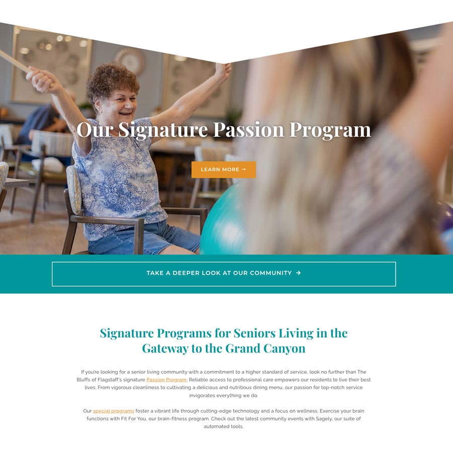
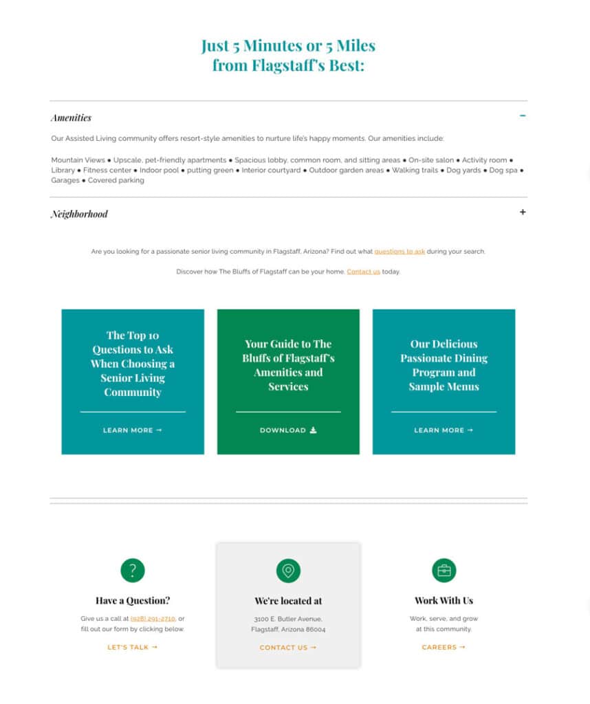
Below are several portions of The Bluffs of Flagstaff’s homepage utilizing our approach to layouts, text, and visual media.


Use Colors Intended for the Web
Web designers apply solid colors with six-digit hex (hexadecimal) codes and RGB (red, green, and blue) values. They may also achieve transparent colors through eight-digit hex codes, in which the extra two digits represent the color’s degree of transparency, also known as its alpha channel. The “alpha” value of any RGBA (red, green, blue, and alpha) number ranges from zero to one and can achieve the same levels of transparency.
Color contrast will be an important part of your website’s accessibility; the Web Content Accessibility Guidelines (WCAG) state, “The visual presentation of text and images of text [should have] a contrast ratio of at least 4.5:1.” To better understand this contrast ratio, enter your favorite colors here.
Read more about Craft & Communicate’s general approach to colors for both print and web design in our recent blog post.
How can I make my site easy to navigate?
Link to Important Pages
Your website should offer two primary methods to explore its pages through linking, and even to visit other sites. First, keep a horizontal navigation menu at the top of every page and vertical menu in its footer; each menu and dropdown/sub-menu item should link to one of your front-facing pages. Avoid nested sub-menus (those with multiple levels) as they can become confusing.
Second, place underlined links within paragraph text (and occasionally, heading text) wherever you believe they could benefit seniors. Internal links—those within a site’s main web address—should open in the same tabs, while external links to other sites most commonly open in new tabs. Linking is not only great for navigation; it can also improve your SEO, or search engine optimization.
Customize Your Design According to Various Device Sizes
The design seniors see on their desktop computers should be different from the one they find on their mobile devices. To make your website mobile-friendly, you may need to make it responsive by narrowing each page’s content width, adjusting image sizes, and changing column widths. Drag-and-drop builders often make this easy through responsive editing views. If you are mainly using HTML and CSS, refer to media queries, which allow you to apply styles to specific device widths.
The more you optimize your website for a wide range of seniors and their families, the more your services will stand out in the highly competitive industry of senior living. We look forward to helping your brand gain recognition both online and in the real world.
Do you need more support?
Craft & Communicate’s website contains plenty of resources that can improve your design and marketing practices. If you would like even more assistance when designing and developing your senior website, view our portfolio of relevant projects and contact us about our web design services.

